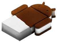
I heard many complaints about "bloated" Android versions made by phone vendors. Here is the thing. Before I got Nexus S, I occasionally used my wife's mobile with TouchWiz. It was quite nice. When I got plain vanilla Gingerbread it felt like crap. Design was ugly and accompanying applications left a lot to be desired.
Upgrading to 4.0 was huge step forward in every respect. Whole platform got new, fresh design. It didn't look like visual ripoff of something else, but rather it had look of its own. Most parts were enriched and felt like a mature product.
But in most relationships, as time passes, you start to notice little annoyances, asking for quarrel.
As new update of Ice Cream Sandwich for Nexus S is announced (4.0.5), I would like to sit with my darling ICS and discuss the list of things that I would like to change. Many are related to performance, which, while not utterly slow, is slightly irritating. Anyway, here is the list:
- Overall smoothness.There are smaller and bigger lags in different parts of UI. I really like snappiness of iPhone. Some people claimed that lags are inherent to Android due to some architectural decisions (and later admitted they were wrong). That's simply not true, I played with friend's old Sony Ericsson Experia Mini, and although that phone has much lower specs, UI was smooth. I can understand that some applications are less than perfect due to sloppy programming, but there is no excuse for OS UI.
- Lazy browser. Google was very proud with speed improvements in ICS version. There was a lot of talk how tile-based rendering help to draw the page faster. Not really. Opera is faster, with or without compression. Mobile Chrome is also better. What bothers me most is that all three browsers have slow start-up times, so if you opening articles from Reader or Currents in browser or doing some other task with lots of back and forth switching between application and browser, you won't be happy camper. Faster start-up please!
- Slooow gallery. Gallery shows pictures from any folder on the SD card. During the start-up, it check every folder on the card and that take ages. It is simply not possible to just open it and show some recently taken pictures. Some people event don't open it directly, but rather they open camera application first and access gallery from there.
- Crappy task switcher. I use it really a lot as a kind of lost of recently used applications. In ICS it is improved for tablets with new design and application preview. On mobile with smaller screen and less processing power, it translates to inefficient screen estate usage and delays. I can only see a couple of applications without scrolling, and if I used many applications, it takes ages to generate preview. It is OK if there were just two or three applications open; if there was six or seven, it becomes unusably slow.
- Hidden menus. There is absolutely no visual clue that Wi-Fi switch hides extended Wi-Fi menu. You must know it is there. Soon you will find yourself clicking on all controls in search for hidden menus.
- To property or not to property. There is no indication is there an property menu for the screen or not, so you have another case of "let's click and see what happens".
- Put back icons to menus. Pure text lists are harder to navigate than those with both icons and pictures. They are introduced to avoid scaling problems with icons and probably to have fresh design, but I don't like it; I stopped counting how many times I pressed wrong item in some places.
- Anemic messaging. First of all, why I can't get messaging on home screen? If there is icon for that for incoming phone call, why I can't have it when there is no incoming phone call? Why messaging can't switch between GTalk and SMS to cut costs iMessage style? Google already has instant messaging service anyway. And why I can't copy content of GTalk message?
- App Drawer's lack of folders. I probably install too much crap on my phone, but I am not the only one. I guess that most of the new owners install every application imaginable. They all appear as one big pile in App Drawer. As Market already has application categories, is it so hard to reflect that structure in App drawer?
- Fragile mobile connection. Sometimes, after giving some Wi-Fi to mobile, it won't switch back to 2G/3G. I have to restart. It probably likes faster connection too much.
- Oversimplified calendar. With big, high-res screen I would like my events on the calendar. Not just colorful lines, real event description with text. Like Business Calendar.
There are some other topics worth mentioning, like UI inconsistencies between Google's own applications or issues with UI on the large screens, but those require articles of their own. I had couple of wishes for new iPad recently, but unfortunately the were not fulfilled; I hope that I will have better luck with the new ICS.

No comments:
Post a Comment